Qualcomm Toq Smartwatch
In 2013, before smartwatches became widely used, Toq Smartwatch was born. Qualcomm’s Mirasol display technology was a revolutionary approach to color displays. Using natural elements of light and reflection, the display is always on and takes little ‘sips’ of power, therefore dramatically extending the battery life of a device.
Toq was a proof of concept showing how Mirasol technology can be used. Its design was centered around its bright colors, and long-lasting battery life.
Team Composition
2 Product Managers
1 Lead Interaction Designer
1 Senior Interaction Designer (me)
2 Visual Designers
7 Hardware Engineers
5 Software Engineers
Timeline and Project Context
8 months to design and develop the watch interface and interactions
Leverage patented technology to prove to prospective customers its innovative features and capabilities
Design within Android environment as the watch technology would need to interface between two devices, the smartphone and the watch
I had no prior hardware or phone app design experience so I had to learn from the ground up how to work within hardware constraints, and how to design within the Android design system.
Background and exploratory
We had the goal of developing a full-featured smartwatch that would help manage information for its users, while we demonstrated the value of the colorful Mirasol display to the world. Our UX team met internally with executives and product directors to get a clear vision of the project. As a team, we researched, asked, explored the following:
Getting on the same page
Mirasol technology
We sat down with engineers to learn how Mirasol works, its advantages and its disadvantages. We understood from the executives the importance of allowing Mirasol’s long battery life and colorful display to be an important part of our UI considerations.
Our competition
We researched what other features, UI approaches, and technical capabilities of other smartwatches (and wearables) were out there. Understanding the way others designed their smartwatches, and how they solved common problems gave us a better idea on what we wanted for our smartwatch.
The target user
After discussions with our product managers and leadership, we concluded our product was targeted at busy, on-the-go business tech users, and secondly, early adopters. We spent some time sitting down with these groups to understand the tools they use to manage their lives.
Based on the research, we came to this strategic decision: Toq is not a smartphone. It manages and pushes high priority information to its wearer and lets them decide whether to respond immediately from their watch or pull out their phone for deeper engagement.
From ideas to interactions
Rapidly sketching through some of the smartwatch's ideas gave our product team a better sense of solutions we were proposing and brainstorm through alternative solutions. Designing a smartwatch UI had its some unique constraints: the small screen size, and finger interactions that didn't block crucial info from being seen.
Early sketches of Toq apps
The applications (or applets, as we called them) we decided to make for Toq were centered around the same principles - helpful for the immediate moment, easy to open and trigger, simple and minimalistic. Working with the lead and product manager, we also devised a mental model for helping the user interact with the various apps: a carousel. A user can set favorite applets within a carousel in an order they wish for easy access. Everything else would be organized in a folder.
Carousel concept for favorite applets
The Toq also came with a companion application for mobile phone. The intent of the app is mostly as a connector between the watch and the user; allowing specific preferences to be set, such as the default clock display, notification preferences, and so forth. The challenge for the mobile app was a completely different one: how to meaningfully organize information so that the user can easily find it, set their preferences, and get on with their day.
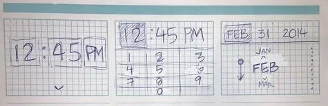
Exploratory on various ways to present several user preferences
Once the sketches and the various approaches were thought out, we began designing the more detailed layouts and interactions of the various watch apps and the Android app. This captured the ideas in a much more tangible way.
We used these higher-fidelity designs present ideas to the project leaders, and later passed on to our visual designers to create the final design.
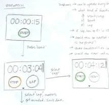
Detailed interaction designs
Interaction design details of the stopwatch
Advanced preferences screens of the Android companion app
Due to its highly proprietary nature, we recruited several internal Qualcomm employees to wear prototype watches containing our most recent designs. We would regularly hold guerilla user tests with this small group to understand their experience using our features.
Depending on how critical the feedback was, we sometimes would return to wireframes or even sketches. Otherwise, small refinements were addressed directly with engineers and updated on UI specs.
Internal usability tests
Qualcomm Toq shows important information and lasts for days on a single battery charge
Instantly connect your phone to your Toq and set up your favorite clock display and applets
Public reception and reviews
Qualcomm Toq was officially released on November 2013. The first inventory of watches was sold out within a day; and for a couple years afterwards, new features were been released every month. Because the purpose of the Toq watch was for it to be an OEM product, the support for new features eventually discontinued.
However, during that time, here's what some people have said about Toq:
“Think about the move from black and white TV to full color TV. Oh what a difference color makes and that’s one way the Qualcomm Toq is different. Toq does a lot of the same things other smart watches do — monitor your fitness, texting, notifications, social feeds, etc., but this smart watch’s touch screen is in full color and always on so you don’t have hit that button again to get it to light up. Swipe right or left to get where you want to go.”
“There are just a ton of little things the Toq got right and this companion app is definitely one of them. You can set any app on your phone to send Notifications to your watch without need[ing] to buy a 3rd party app like you do on a Pebble or Sony SW2.”
“I can use it to control my phone and receive short messages and alerts without picking up the phone. Unlike other smartwatches, it offers days of battery life and an outdoor viewable screen.”